Pedalling Perfection
Overview
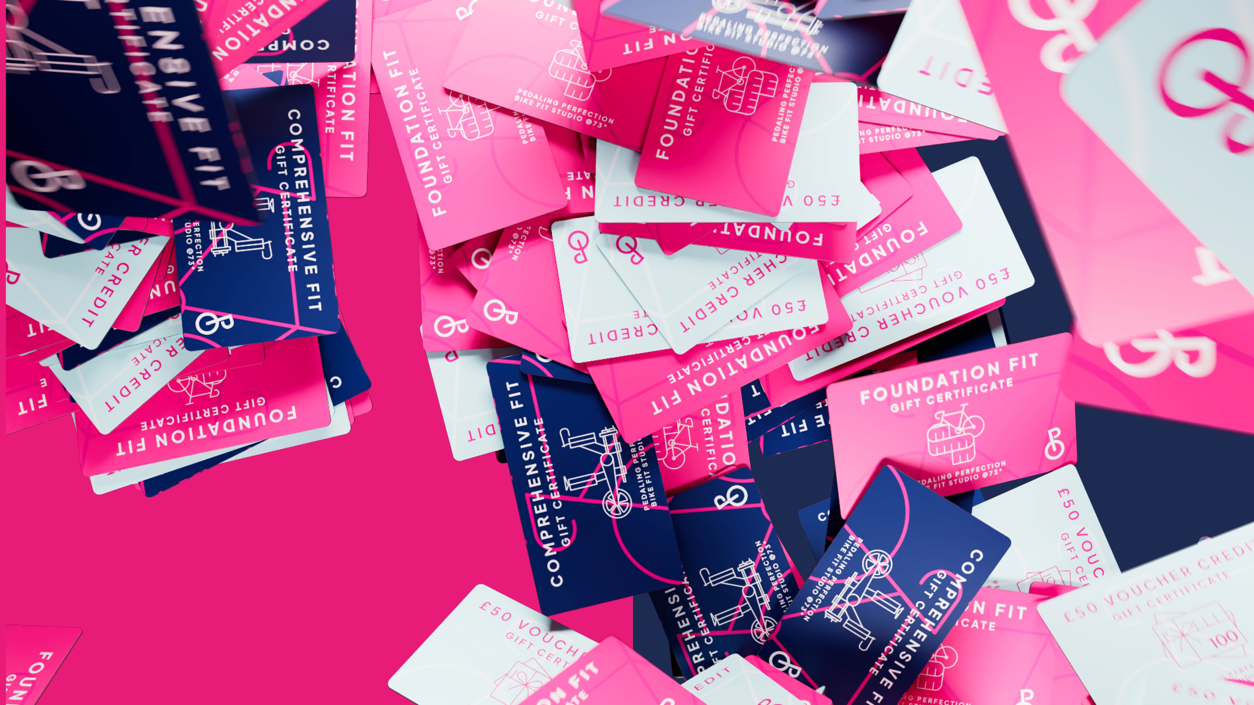
Pedalling Perfection is a specialist bike fitting brand, and the client approached me to create a full brand identity for their new business. The brief was to build something instantly recognisable as a bike-fit brand, while still feeling fun, playful, and genuinely welcoming — avoiding the cold or overly clinical feel often associated with the category.
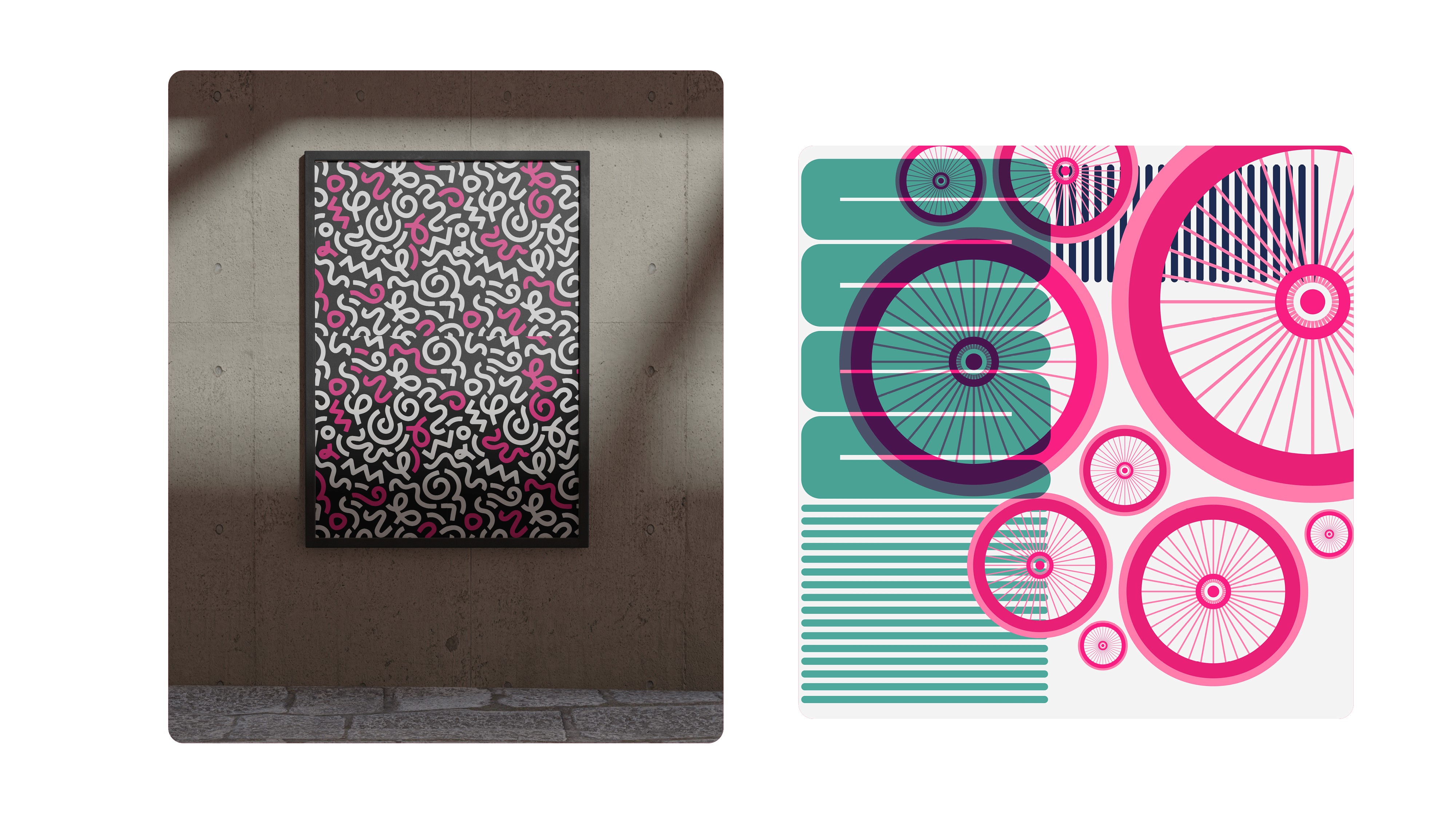
The project began with discovery and moodboarding, where it quickly became clear that the identity needed to balance two key qualities: a sense of medical credibility and technical precision, paired with a bright, approachable visual language. This balance was achieved through clean, modern typography and a confident, playful colour palette that helped soften the more clinical aspects of the service.
Alongside the visual identity, I also advised on the website direction, helping shape how the brand should translate into a clear, user-friendly digital experience. This included guidance on layout, hierarchy, and how motion and branding elements could be used subtly to build trust while keeping the site accessible and easy to navigate.
As the identity developed, the focus shifted to bringing the brand to life through motion. I animated the logo to add personality and memorability, and created a set of social media toolkits to help Pedaling Perfection launch confidently and maintain consistency across platforms.
The result is a brand that feels knowledgeable and trustworthy, while remaining accessible and human — reflecting both the technical expertise and the friendly, supportive nature of the service.
Scope
Graphic Design
Branding